In today's digital era, having a strong online presence is vital for businesses and individuals alike. However, designing a visually appealing website or application is not enough - it also needs to be functional and intuitive for users. This is where the balance between aesthetics and functionality in design comes into play. But what exactly is the difference between UX/UI and frontend design?
In this article, we'll unravel the complexities of these terms and explore their collaborative dance in creating engaging digital platforms. We will also provide best practices and a real-life example of how to achieve this balance effectively. Get ready to dive into the world of web design and discover the secrets to success!
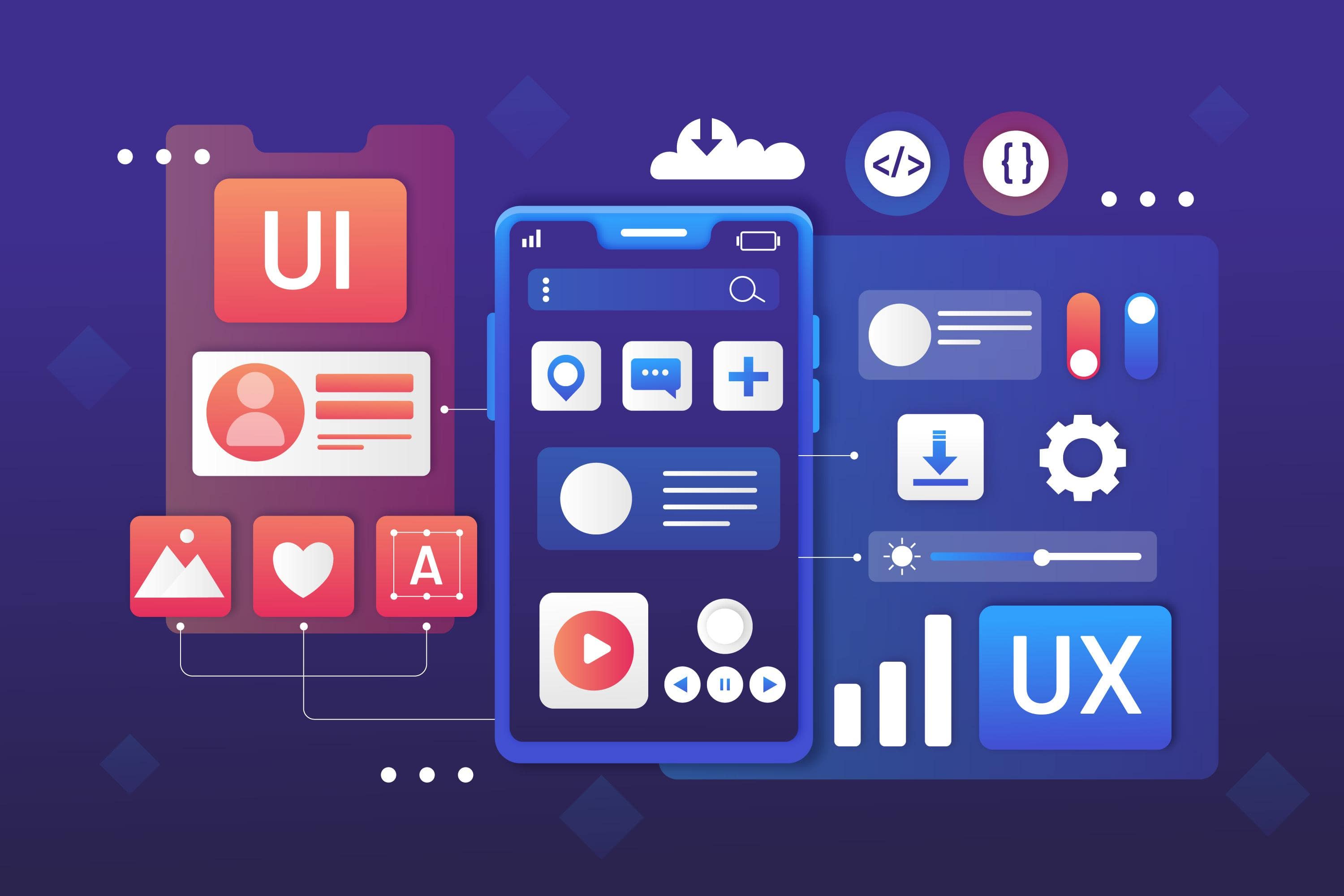
What is UX/UI Design?
**User Experience (UX) and User Interface (UI) Design** are two sides of the same coin, collaborating to create an impactful digital experience. UX Design, the psychological backbone of a digital product, is rooted in understanding the user's needs, emotions, and behaviour, designing a roadmap that is intuitive, efficient, and user-friendly. UX design focuses on creating an enjoyable experience for the user.
Conversely, UI Design is the aesthetic hero, responsible for the visual and interactive elements. It's about crafting an interface that is not only visually pleasing but also aligned with the user journey outlined by the UX. UI design focuses on the visual elements of a website or application.
UX and UI are closely related and work together to create a seamless experience for the user. Common elements of UX design include user research, wireframing, and prototyping, while UI design focuses on typography, colour schemes, and the overall look and feel of a website or application.
Think of UX as the architect drafting the blueprint, and UI as the interior designer who brings this plan to life.
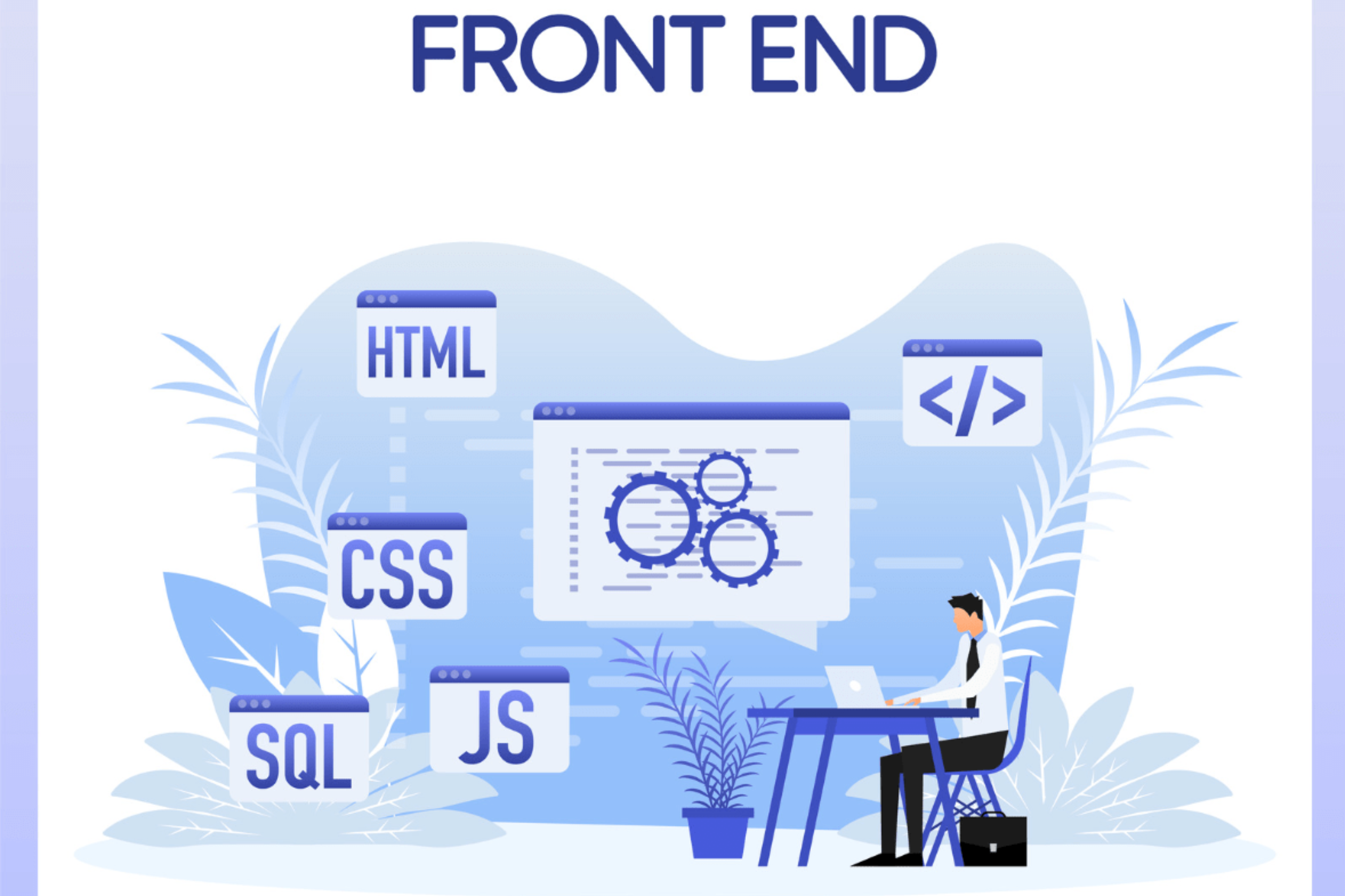
What is Frontend Design?
On the other side of the design spectrum, we find Frontend Design. As the bridge between the design and the code, frontend designers turn UX and UI designs into a live, interactive environment. Frontend designers use languages like HTML, CSS, and JavaScript to construct the interface.
They're responsible for bringing the UI designer's vision to life, ensuring that the website or application looks good and functions smoothly across various devices and browsers. This involves designing visual elements such as the layout, colour schemes, navigation menus, forms, and buttons that users interact with while using a website or application.
While the UI designer selects the shades of blue for the website, the frontend designer translates this choice into a CSS code.
Balancing Aesthetics and Functionality: Best Practices
Creating a visual symphony that's pleasing to the eye while ensuring seamless user navigation is a hallmark of exceptional design. Striking the right balance between aesthetics and functionality is paramount as it contributes significantly to a user's experience, and by extension, their overall perception of the brand or product. An aesthetically stunning design might reel users in, but it's the functionality that keeps them engaged. By doing this, users are more likely to engage with a website or application and return in the future.
Here are some best practices to consider:
Whitespace, often known as 'negative space', is a powerful tool in your design arsenal. It gives your design elements room to breathe, reduces cognitive load, and guides the users through your interface by creating visual hierarchy. Google's homepage is a textbook example of effective use of whitespace, where the focus is solely on the search bar.
- Selecting Appropriate Typography
Typography is not merely about selecting beautiful fonts; it's an intersection of aesthetics and readability. Fonts should mirror the personality of your brand while being easy to read across various devices. Mixing and matching different font styles can create visual interest, but be wary of overdoing it. Limit your design to two or three fonts to maintain a clean, uncluttered look. Apple effectively balances typography and aesthetics by using the sans-serif font "San Francisco". This reflects the brand's clean and minimalist design philosophy while also being easily readable across different devices.
With an increase in mobile browsing, page speed has become a critical aspect of user experience. In fact, research shows that 40% of users abandon a website that takes more than three seconds to load. A visually stunning website is of little use if it takes forever to load. To ensure your website loads quickly, aim for a load time of two seconds or less. You can optimise your images, minify your code, leverage browser caching, and consider using a Content Delivery Network (CDN) to achieve this goal. Amazon is known for its great page speed, with its website loading in less than two seconds on average. The company achieves this through advanced caching techniques and a sophisticated Content Delivery Network (CDN).
User feedback can play a crucial role in balancing aesthetics and functionality. Regularly inviting, and more importantly, implementing user feedback helps keep your design grounded in user needs, leading to a more functional and user-friendly design. The companies such as Airbnb do this effectively by regularly conducting user research and gathering feedback from their global community of hosts and guests to improve their platform's design and functionality continually. This demonstrates the importance of listening to users to create a more user-friendly and engaging platform.
Regular testing of your design allows you to catch and fix any usability issues before they frustrate your users. Various testing methods like A/B testing, heat maps, or user surveys can offer valuable insights and help fine-tune the balance between aesthetics and functionality. For instance, Dropbox performed an A/B test on its homepage that resulted in a 10% increase in sign-ups. The company also uses heat maps to analyze how users interact with its interface and identify areas that need improvement.
A harmonious blend of aesthetics and functionality is a moving target and requires constant refinement. By adopting these best practices, you'll be well on your way to crafting designs that are as delightful to use as they are to look at.
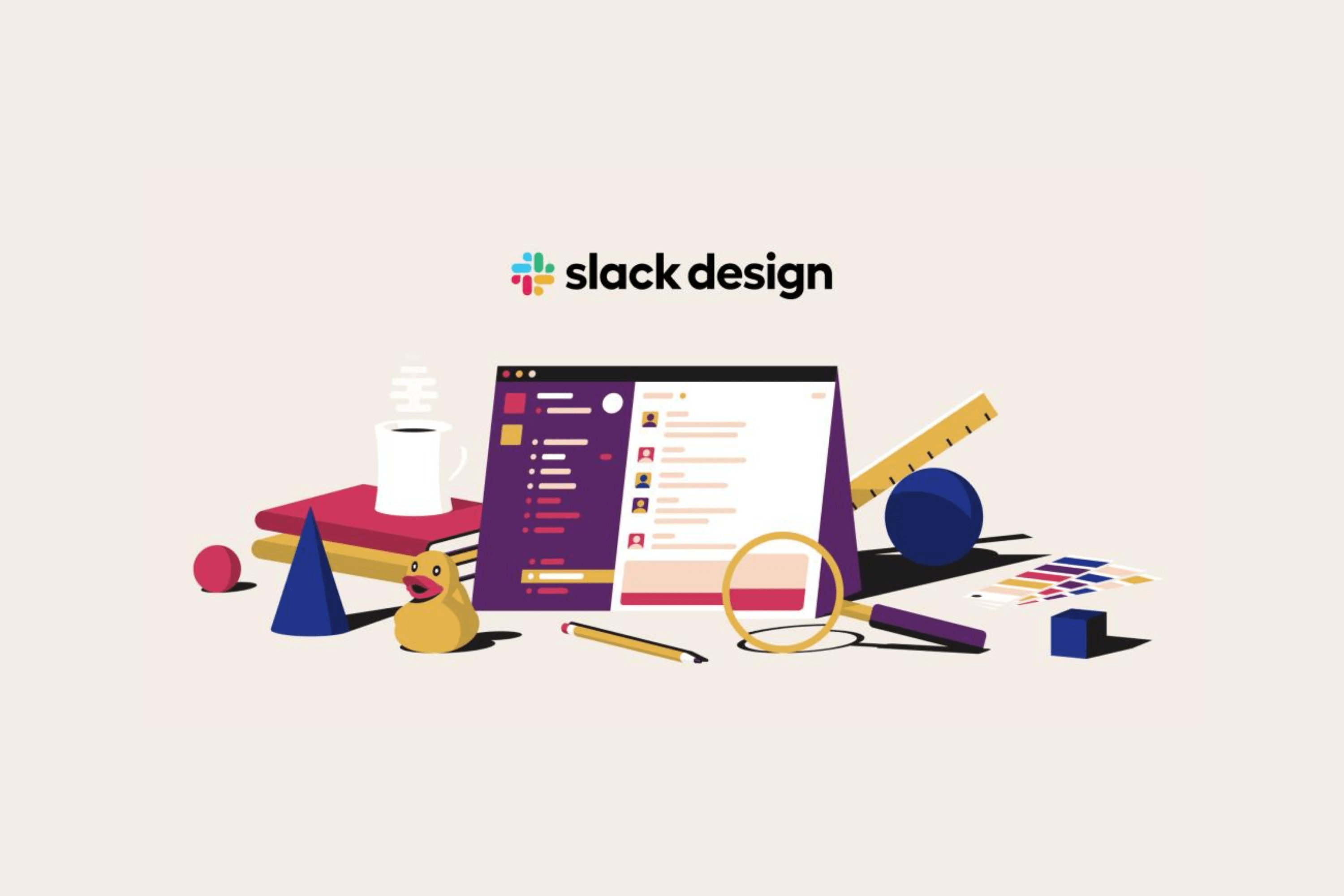
Slack: A Perfect Example of a Great UX/UI Frontend Design Product with Impressive Numbers
The story of Slack's success is a perfect example of the intricate dance between aesthetics and functionality. As one of the leading collaborative communication platforms globally, Slack combines striking design with a highly intuitive user experience, making it a popular choice among businesses and teams.
Slack's interface is a masterstroke of simplicity, with a clean and minimalistic aesthetic approach. Its use of contrast, whitespace, and bold, legible typography facilitates easy navigation and readability. The pleasing combination of colours not only provides visual interest but also aids in the user's cognitive process, with different colours signifying various types of content.
When it comes to functionality, Slack is robust and user-focused. It allows users to easily navigate through different channels, private messages, and shared files, all from a single panel. The platform's powerful search functionality makes finding past conversations a breeze, while the ability to customise notifications ensures users stay in the loop without feeling overwhelmed.
Moreover, Slack's integration with other popular workplace tools like Google Drive, Trello, and Asana further boosts its functionality, allowing users to manage multiple workflows from one centralised platform.
By skillfully balancing a visually appealing design with seamless functionality, Slack not only simplifies team communication but also enhances productivity and collaboration. With over 12 million daily active users, including Fortune 100 companies, Slack's functionality is a strong point, boasting easy navigation, powerful search, and customizable notifications. Users spend an average of 9 hours connected to Slack each workday, showcasing high engagement. Slack has facilitated over 5 billion actions weekly and has integrated with over 2,400 applications.
As we move forward, Slack's success illuminates the importance of balancing aesthetics and functionality in design for creating an engaging user experience.
Conclusion
Balancing aesthetics and functionality is no easy feat. It requires a deep understanding of UX/UI design principles and frontend development. As technologies evolve, this dance between design and functionality will only become more intricate and immersive.
To keep pace with these changes, continue exploring and educating yourself on these design principles. Remember, great design is an endless journey of learning and experimentation. So, take the leap, and keep designing!