Ever noticed those tiny animations when you like a post or the gentle nudge when you’ve entered a wrong password? These little details, known as microinteractions, play a huge role in your online experience. All the small details that go unnoticed - a click confirmation, a hover effect, or a simple notification sound make a big impact on user satisfaction and are one of the key elements of successful UX/UI design.
In this blog post, we'll explore the definition and importance of microinteractions, designing effective microinteractions for user guidance and engagement, common mistakes to avoid, and examples of microinteractions done right. Let’s dive in and see why these tiny elements matter so much in the vast world of UX/UI design.
What are Microinteractions?
Microinteractions are small user interface interactions that help users interact with a website or app. These tiny details go unnoticed, but they play a vital role in enhancing user satisfaction. A microinteraction can be a simple animation when hovering over a button, a notification sound when a message is sent, or a progress indicator when uploading an image.
They differ from macro-interactions, which involve much larger actions such as the process of signing up for a new account or submitting a form. Microinteractions have a significant impact on UX/UI design.
Why are Microinteractions Important?
The most successful websites and apps are ones that cater to users' emotions, aesthetics, and functionality. Microinteractions make an impact on user satisfaction by offering feedback, guiding user actions, and engaging users from start to finish. They elevate user experience by providing subtle guidance and cues that help users understand the interface.
It’s all in the details! These tiny elements can make you feel understood by a website or app. They guide you, give feedback, and make the digital space feel a bit more human. Focusing on these small details enhances the overall design experience and can be the difference between a user enjoying their interaction or leaving a website altogether.

Designing Effective Microinteractions for User Engagement
Microinteractions play a pivotal role in user experience. They serve as the bridge between users and software, creating a dialogue that is responsive, intuitive, and engaging. Here's a deeper dive into effective designing these micro-moments for optimum user engagement.
Understanding User Intentions and Needs
To design effective microinteractions, it's essential to map out user journeys and identify opportunities for microinteractions. This journey can be complex, spanning from the initial touchpoint to the achievement of a primary goal. By mapping out their journey, designers can pinpoint moments where these subtle cues can make a massive difference.
These moments might be as straightforward as a user trying to refresh a page or as them hesitating over a particular button. In such instances, microinteractions can provide cues, such as a rotating icon or a subtle animation, ensuring users aren't stranded without feedback or clarity. Or if you look at the scenario of entering an incorrect password - an immediate microinteraction, such as a gentle shake of the password box or a soft red glow, communicates the error without the need for elaborate pop-ups or alerts.
Principles of Effective Microinteractions
- Less is More: A golden rule in design. Microinteractions should be subtle, enhancing the experience without being too obvious. While this might sound cliched, the subtlety is the essence of microinteractions. They're there to enhance the user experience seamlessly, not to steal the spotlight. The more invisible they are, the more natural the user interaction feels.
- Prompt Responses: When a user performs an action, they seek immediate feedback. Whether it’s a gentle vibration or a color change, microinteractions provide this in real-time. Today, we are all accustomed to real-time feedback. When a button is pressed, a link clicked, or a gesture made, we expect an immediate indication of that action being recognised. This could manifest in the form of a haptic feedback, an animated tick, or even a slight change in colour or shadow. Whatever form it takes, promptness is key.
- Purposeful Design: It’s crucial that every microinteraction serves a purpose. They’re not just decorative elements but tools to simplify and enrich user interaction. Every microinteraction should come from a genuine need or gap in the user experience. Designers must ask: "Does this microinteraction add value? Does it simplify a process? Or is it just decorative?" If it doesn’t serve a real purpose, it risks being more of a distraction than a tool for enhancement.
Choosing the right tools and techniques
The beauty of microinteractions lies in their versatility. With numerous software options available, it's essential to choose ones tailored for microinteractions, ensuring precision and effectiveness. Whether it's software for animations or techniques for visual cues, using the right tools can make a world of difference. Software dedicated to animating these subtle shifts or creating responsive visual cues can make the design process smoother and more precise. For instance, integrating soft sounds with delicate animations can offer a multi-sensory engagement. Marrying visual cues with sounds or animations can result in a more immersive experience.
But, it’s vital to ensure this blend feels natural and doesn't overwhelm the user. If an interaction feels forced or discordant, it can push the user out of their flow. Therefore, the synergy of visual, auditory, and tactile elements should always be in harmony, catering to a seamless and immersive experience.
Some of the best tools in the UX/UI design world are:
- Adobe XD for intricate animations,
- Figma for collaborative design, and
- Principle for dynamic interactive prototypes.

Common Mistakes to Avoid in Microinteraction Design
While they may be subtle, microinteractions play a vital role in the user's journey. Ensuring they're designed thoughtfully and cohesively can make all the difference. Navigating the subtleties of microinteraction design requires a keen eye for detail and an understanding of user needs.
Here are some pitfalls to steer clear of:
- Overdesigning: Too many elements or animations with overly complicated interactions can distract users and be frustrating to navigate. This not only confuses users but can also detract from the core functionalities of a product. Always remember the adage: "Just because you can, doesn't mean you should." The key is to prioritise function and elegance, adopting a minimalist approach.
- Neglecting Accessibility: A product's design should be inclusive, ensuring it's usable by everyone, including those with disabilities. Overlooking accessibility in microinteractions can lead to parts of your product being unusable or even frustrating for some users. For example, a colour change might not be discernible to someone who's color-blind, and a gesture-driven microinteraction might be a challenge for someone with a motor disability. Always design with a diverse user base in mind, utilising tools and guidelines that emphasise accessibility.
- Inconsistency: Consistency is key in ensuring that microinteractions function as expected across all pages of the site or app. When microinteractions vary wildly throughout a product, it can create a jarring experience for users. Imagine reading a well-written book but with randomly changing fonts every few pages. To avoid this, designers should establish a microinteraction brand design guidelines. This ensures that every small interaction feels like a cohesive.
- Ignoring User Feedback: Never assume the first design iteration is the final one. Failing to listen to user feedback can result in unhelpful or distracting interactions. Users are the ultimate judges of any product, and their feedback is invaluable. After the initial design phase, iterative testing with real users can provide insights that might not have been evident before. Perhaps a particular microinteraction is confusing, or maybe another feels unnecessary. Engage in iterative testing, and be open to refinements based on user feedback to enhance overall experience.
Examples of Microinteractions Done Right
Microinteractions, when executed with finesse, can dramatically elevate the user experience, making interactions feel intuitive and engaging. Here are some exemplary instances where microinteractions shine, enhancing usability and delighting users:

Social Media Likes
Almost everyone familiar with social media knows the satisfaction of “liking” a post. The subtle animation - be it a heart filling up, a thumbs-up icon, or a burst of stars—not only confirms the action but also adds a touch of joy to the experience. This instant feedback loop not only acknowledges the user's interaction but also provides a dopamine hit, encouraging further engagement.

Pull-to-refresh Mechanism
A staple in many mobile apps, the pull-to-refresh action is a masterclass in intuitive design. As users pull down, a small icon (often an arrow or a circle) animates, signaling the refresh action. Once released, the content updates, giving users a sense of control and immediacy over their digital environment. It feels natural, mirroring the act of physically pulling down an old page to reveal a new one.

Password Strength Indicators
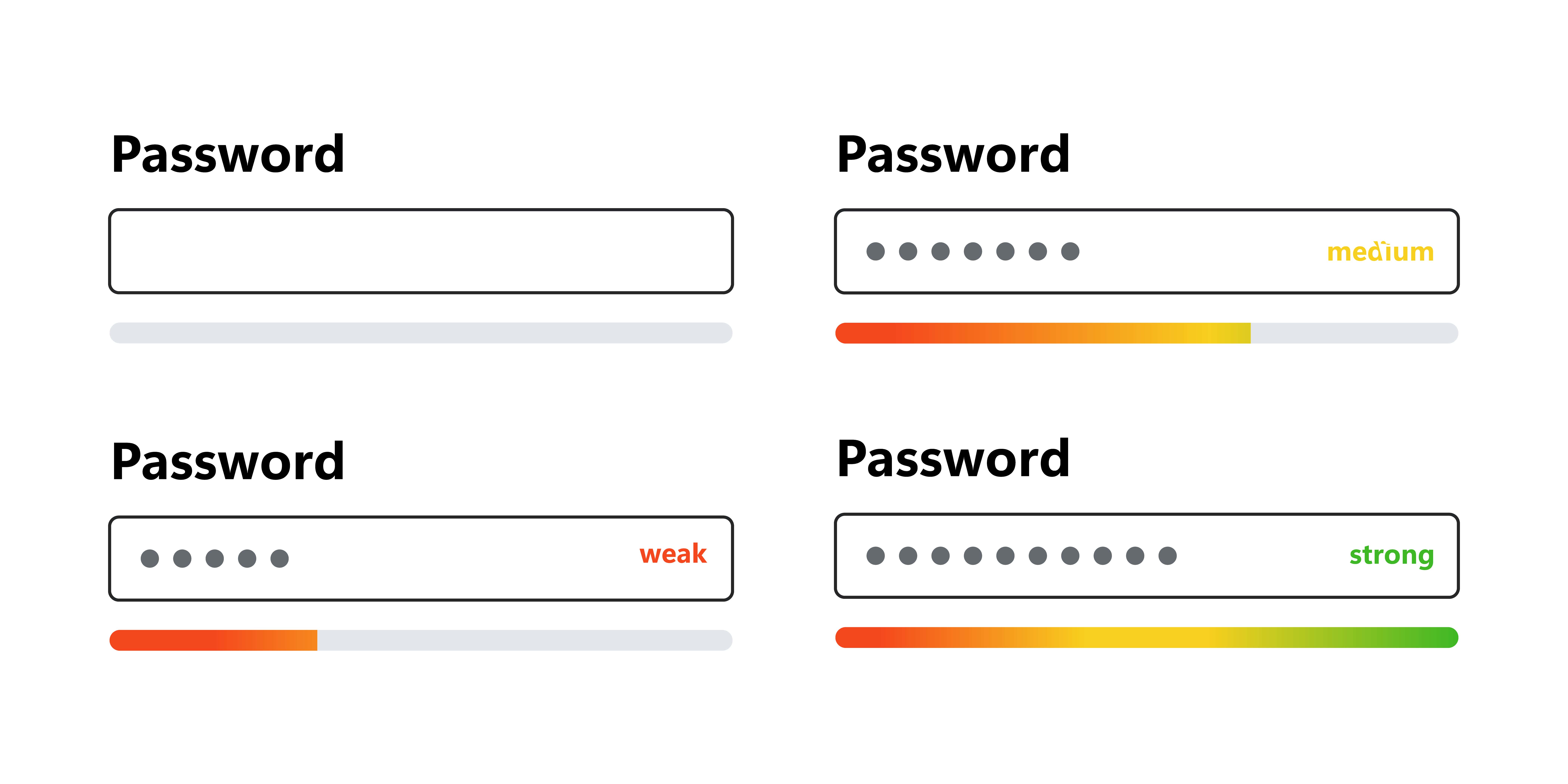
Security is paramount, but how do you encourage users to set strong passwords without frustrating them? Enter the password strength indicator. As users type, visual cues, such as a colour-changing progress bar or descriptive words like "weak" or "strong", provide real-time feedback. This not only guides users towards better security practices but also turns the mundane task of password creation into an interactive challenge.

Transition Animations in Mobile Apps
Smooth transitions can make navigating a mobile app feel like a seamless journey rather than a series of uncoordinated steps. Whether it's a menu sliding in from the side, a card expanding to reveal more information, or a page fading into another, these animations offer visual continuity. They guide the user's attention and provide context, ensuring that the user never feels lost or jarred by sudden changes.
There are many more examples of microinteractions done right across the web. A hover effect that showcases an item's size, an error message that appears when inputting incorrect login information, or a sound that plays upon a successful action on the site are all examples of effective microinteractions. Many websites use notification sounds to let users know when they have new messages or notifications.

LinkedIn Microinteractions Case Study
LinkedIn has strategically incorporated microinteractions across its platform, enhancing the user interface and overall experience. Here are a few examples of how LinkedIn has done this:
-
Progressive Disclosure: When posting an update on LinkedIn, additional options (like adding photos, videos, or documents) are initially hidden and only appear when you click in the text box to start writing. This is a classic example of progressive disclosure where only necessary information is displayed upfront, reducing cognitive load for users.
-
Button Transformations: When you hover over certain buttons, such as 'Like' or 'Comment', they change colour. This immediate visual feedback informs the user that their action has been noticed by the system and they can proceed with confidence.
-
Loading Animations: When loading content, LinkedIn displays a pulsating logo animation. This not only shows users that content is being fetched, but also keeps them engaged during the wait.
-
Real-time Notifications: LinkedIn utilises real-time notifications to alert users of new messages or updates. A red dot appears over the notification bell icon indicating new activity, which disappears once the user checks it.
-
Validation Feedback: Upon creating a post or sending a message, LinkedIn provides validation feedback through subtle animations and text changes. For instance, the 'Post' button transforms to 'Posting...' until the process completes, keeping users informed about the status of their action.
In essence, these examples underscore the profound impact of well-designed microinteractions. They may operate in the background, often unnoticed, but their contribution to a fluid, engaging, and intuitive user experience is undeniable.
Small Details, Big Impact
In conclusion, microinteractions are a crucial factor in creating an optimal user experience for websites and apps. These small details have a significant impact on user satisfaction, engagement, and guidance throughout the interface. By focusing on principles such as subtlety, simplicity, and timely feedback, designers can create effective microinteractions that enhance functionality without causing distractions. Following common mistakes to avoid such as overdesigning, neglecting accessibility, inconsistency, and ignoring user feedback can take microinteractions from good to great. By understanding the importance of microinteractions and implementing them thoughtfully, you can create a website or app with small, yet significant, details that result in a positive user experience.
Feeling intrigued?
At Cogify we believe in creating digital experiences that are not only visually stunning but also intuitively functional. Let's elevate your digital platform together!
Explore Cogifyy Services Now


