UX/UI
Think in Colour: Master the Power of Chromatics in UX/UI Design
Explore the transformative role of colour psychology in UX/UI design. Discover how the right colour choices shape user experiences, drive actions, and enhance digital engagement.
- Autor
- Cogify AG
- Datum
- 1. November 2023
- Lesezeit
- 7 min
- colour psychology in UX/UI design

Colour psychology is vital in UX/UI design, influencing more than just visuals. It shapes the user experience, driving actions and perceptions. The right colour choices not only enhance design aesthetics but also improve usability and user engagement.
In this article, we'll explore the role of colour in UX design, showing how it can evoke emotions and guide user behavior for a more effective and user-friendly experience. Let’s get started!

The Psychology Behind Colours
Colours have always been powerful emotional triggers. Red often suggests urgency or affection, while blue feels trustworthy and calm. However, individual experiences can shift these perceptions. For some, yellow might evoke joyful memories, for others, caution or envy. These personal interpretations, even if they deviate from societal norms, can strongly influence a user's interaction with a product. At its core, colour psychology is about understanding how colours make people feel and act.
Colour is one of the fundamental elements of design, and it should be taken into consideration right from the start of the design process. It can boost brand recognition significantly, by up to 80%. Designers must harness the emotional impact of colours for better user engagement. But understanding colour in UX isn’t just about knowing the basics. It’s about diving deep into how colours work across different interfaces and cultures.
Colours and Cultural Differences
Before we dive into aligning colours with brand identitiy, it's crucial to touch on an area designers sometimes miss: cultural differences.
Different cultures perceive colours differently. In the West, white often means purity, hence its use in weddings. But in many Eastern cultures, like Japan, white is a symbol of mourning. These differences highlight the need to study cultural contexts, especially when targeting diverse groups. Using the wrong colour might send unintended messages, pushing users away rather than drawing them in.
A designer's goal is to connect with as many users as possible, which means being careful with colour choices and imagery that might be culturally sensitive. Some colours, like orange, are positively viewed globally, but colours like white need more thought, depending on the audience. If you're aiming for a global reach, be cautious about these cultural interpretations. For a niche cultural audience, however, you might have more colour flexibility.
Overall, being mindful of these cultural differences can lead to designs that resonate with a broader and more diverse audience.
Aligning Colour with Brand Identity
Your brand's colours should be a mirror reflection of its identity. The colour palette needs to represent both the brand's core values and the industry's expectations, creating a clear visual link between the brand's identity and its appearance.
A brand that values sustainability might lean towards earthy tones, while one promoting luxury might opt for metallic shades. A high-end brand might use gold, silver, and deep navy for sophistication, while a health brand might prefer calming shades like green, blue, and white. Tools like Adobe Colour or Coolors can help design fitting colour schemes.
But it's not just about showcasing brand values. It's key to stand apart from competitors and align with industry trends. Choosing a colour palette too similar to a competitor's can blur brand identities. Once you’ve chosen your brand's colours, it's also important to maintain this palette consistency across all platforms, mediums, and marketing materials for easy recognition and trust.
The Impact of Colour in User Engagement and Conversions
Colour greatly influences how users interact with digital platforms and their decisions to take action. The right shades can increase click rates, boost buying intentions, and keep users coming back. A bright colour for a call-to-action button can drive more clicks. For example, a red "BUY NOW" button might encourage quick purchases, while a green one feels inviting.
Contrast is also key. Good contrast between text and its background isn’t just good design—it ensures readability. Without it, many users, especially those with vision issues, might struggle. This approach not only broadens your audience but also prioritises design inclusivity and adheres to design standards.
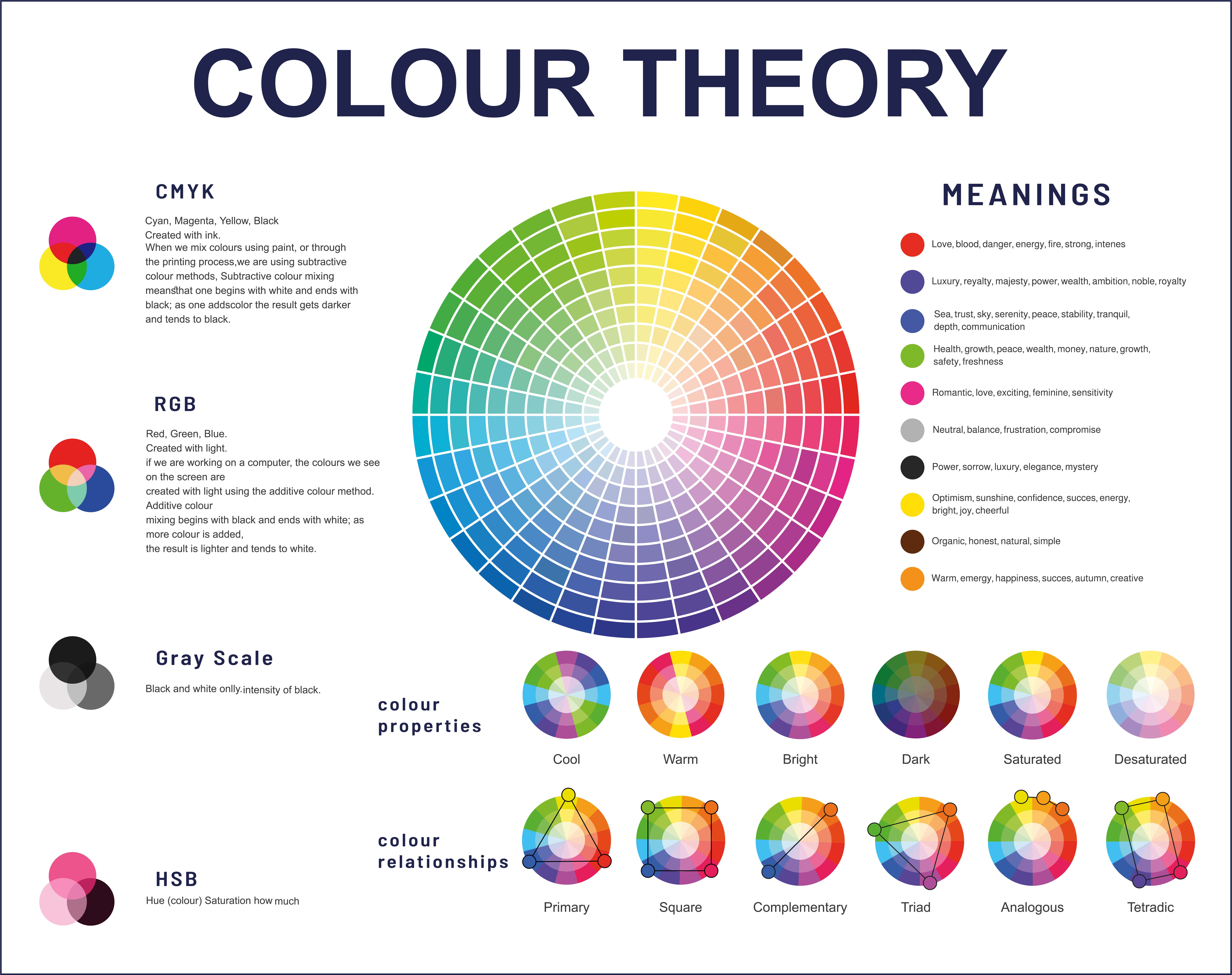
Understanding the Meaning of Basic Colours
Diving deep into the essence of each colour is vital to ensure that a design resonates with its intended audience. Therefore, the first step in creating a brand colour palette is to understand what different colours mean. Here's a concise overview:
- Blue – Representing trust, calm, and reliability, it's popular among corporate and banking platforms. While soft blue might feel contemplative, a vivid azure hints at open dialogue. Example: Facebook
- Red – Symbolizing urgency and energy, red is hard to ignore. In the digital design, red is often used for call-to-action buttons or to draw attention to critical elements. Soft red or pink shows love, while deep maroon exudes class. Example: Coca-Cola
- Black – While it adds sophistication, too much can dominate. In design, black highlights bright colours, giving a contemporary, stylish look. Example: Chanel
- White – The minimalist’s favorite, white offers clarity and breathability in designs. It’s the silence between the notes, ensuring other elements shine while epitomizing purity and simplicity. Example: Apple
- Gray – Neutral yet impactful, from chic silver to moody shades, gray offers versatility, perfect for a balanced, modern and professional design backdrop. Example: Mercedes-Benz
- Yellow – Symbolizing joy, yellow is like a splash of sun. Great for youthful layouts or to add freshness. Whether you're designing for a kids' app or aiming for a fresh and invigorating web layout, yellow can be your ally. A golden tint adds a luxurious feel, evoking success. Example: McDonald’s
- Orange – Bursting with energy, orange signifies creativity and spirit. Brands seeking vibrancy often pick this. And if you're looking to inject some nostalgia, orange’s retro connotations can be quite effective. Example: Home Depot
- Purple – Purple strikes a balance between the luxury of its regal past and its modern undertones of mystery and intuition. For brands aiming to come off as innovative or imaginative, purple, especially in its brighter shades, can be quite effective. Example: Cadbury
- Brown – Warm and earthy, it's not common in digital. However, for brands aligned with nature, or even luxury, like premium leather, brown can be a refreshing choice. Example: UPS
- Green – Green's dual nature makes it unique. From symbolizing wealth with its darker shades to reflecting nature and sustainability, it can adapt to varied design objectives. For themes of growth, vibrant lime works well. Example: Starbucks
Daring to Be Different: The Magic of Distinct Brand Colours
While basic colour knowledge is essential, it's just a starting point for designers. The 60-30-10 Rule offers a balanced mix:
- 60% dominant neutral,
- 30% secondary shade, and
- 10% accent splash.
It's about striking the right visual balance. But remember, colours are like outfits for brands. Wear what everyone else does, and you'll blend. Choose differently, and you'll stand out.
Think of Spotify. They could've picked a regular green, but they went for a bright one. Now, that green instantly reminds you of them. T-Mobile picked a striking pink over standard red or blue, making them memorable. Distinctive colours leave a lasting impression in our minds. It's this creative twist with colours that designers can and should play with.
Being unique matters, but it's also key to stay aligned with the brand's essence. There's a balance between being unique and being relevant.

Playing with Shades: Fine-Tuning Your Brand Colours
Choosing a standout colour is only the beginning. The shades - those subtle shifts in lightness or darkness - make all the difference.
Take Coca-Cola, for example. Their iconic red is instantly recognisable. But have you noticed the slightly darker shade they use on their cans compared to their ads? It's subtle, but it makes a difference. Similarly, Starbucks doesn't just use green; they've chosen an earthy shade that feels earthy and cozy, just like their stores.
It's not just about picking a colour; it's about refining its spectrum. Even the slightest adjustment can redefine its character, helping your brand distinguish itself further. Remember, mediums matter. Digital displays and print can render colours a bit differently. Brands need to be attuned to these slight shifts.
Conclusion: Painting the Digital Canvas with Purpose
In the vast digital space, colour is more than just decoration. It's a powerful tool that shapes emotions, directs user actions, and defines brand identity. Navigating the nuances of colour psychology is essential for creating designs that both stand out and connect deeply with users.
Every shade carries meaning, cultural significance, and potential impact. Brands must choose wisely, considering not just aesthetics but the broader picture of user engagement and brand messaging.
At Cogify, we blend art and strategy in our brand design services, ensuring every colour choice is intentional and impactful. As you shape your brand's digital presence, remember: the right colours can make it memorable, resonant, and influential.